
In 2026, most consumers expect high-quality UX design when interacting with brand websites. Yet most still get disappointed.
The outcome of poor UX design — particularly in ecommerce — is a high site abandonment rate, a poor brand reputation, and difficulty in convincing consumers to convert. In fact, some studies suggest that most people won’t return to a website following a poor user experience.
With this in mind, great web design — which naturally incorporates user experience and user interface design — must remove user friction and encourage a natural flow through the buyer’s journey.
This post covers some of the most essential UX design strategies to improve ecommerce performance, along with several examples of businesses doing UX design right.
Sources of UX Friction and Their Design Solutions
There are numerous UX rules you should be aware of as an ecommerce business owner. In fact, one of the biggest authorities on UX design — the Baymard Institute — identified 1,254 design guidelines based on more than 200,000+ hours of research.
However, incorporating all of these tips may not be viable for your ecommerce store. You’ll want to focus on high-value user experience design tactics so that you can effectively prevent user frustration and drive conversions.
So, what are the most essential ways for you to resolve common UX design mistakes on your website? Below you’ll find several examples of frustrating design practices and their user-centric solutions.
Intrusive Homepage Ads
Visitors practically never enjoy web browsing experiences that are constantly interrupted.
When browsing content (or products) online, most people have a clear idea of a pain point they wish to resolve. And their main priority is to move through the buyer’s journey as easily as possible.
Intrusive homepage ads — though attractive in their ability to communicate conversion-inspiring information — are rarely user-friendly. And that’s not just because they disrupt or block on-site content. More importantly, they’re often completely irrelevant to web visitors’ specific needs.
With this in mind, one of the best UX strategies you can use to improve ecommerce site performance is to reduce the number of pop-ups and homepage ads to a minimum. Sure, you can opt to incorporate such elements into your online presence. But if you do, make sure that they actually benefit your target audience and drive purchase intent — like the 10% off welcome gift offer on the Ice Cartel homepage.
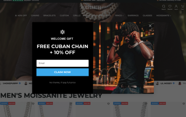
Source: icecartel.com
Lack of Core Product Explanation
Clarity in web design is essential.
When they understand your offer, consumers are far more likely to recognize its value.
Moreover, research suggests that user-centric product explanations effectively elevate purchase intent in ecommerce settings.
So, if you want to reduce user experience design friction and improve your site’s performance, do your best to present your audience with sufficient (and easy-to-understand) product information.
You don’t necessarily have to go into detail in the hero section of your homepage. But highlighting core user benefits in your site’s first screenful is a great strategy to ensure web visitors notice these factors, making them far more likely to become customers.
For example, Rippling’s value proposition promotes “HR, IT, and finance data all in one platform,” making it crystal clear that this brand’s solution aims to boost team productivity through automation.
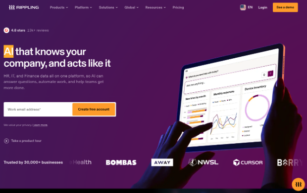
Source: rippling.com
Unclear Navigation and CTAs
When interacting with businesses online, consumers want certainty — and not just in terms of what they’d be getting from a transaction. They also want a clear picture of what their buyer’s journey will look like.
Navigation menus and CTAs are hugely important in this regard, seeing as they shape web visitors’ expectations about the nature (and future) of interacting with your business.
A clear, logical navigation menu, as well as unambiguous calls to action, can provide ecommerce customers with essential information about the steps within their buying journey. Moreover, these UX elements can provide information to help shoppers understand what they need to do to achieve the outcomes they’re after.
For instance, the Custom Sock Lab website invites prospects to “Start [their] project,” instantly reinforcing the notion that this business sells fully customized products, whose production is based on detailed user specifications and instructions.
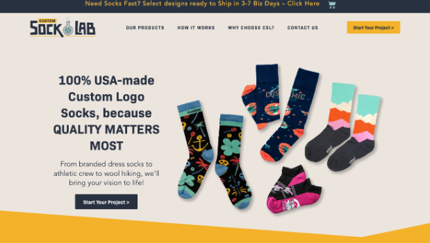
Source: customsocklab.com
Not Creating Manageable Chunks in Product Categorization
Providing web visitors with a ton of information may seem user-friendly. But in truth, it’s anything but.
Yes, details matter. Nevertheless, too much information leads to cognitive fatigue. And that’s bad — especially if you’re looking to boost conversions.
Detail-heavy communication often interrupts the buyer’s journey. It makes product understanding difficult, and it can be frustrating for consumers who are after quick solutions to their simple pain points.
Your UX strategy should include design decisions that make it easier for your web visitors to find the information (or products) they’re after.
Creating manageable chunks in product categorization menus — like the ones on the Fugazzi website — is one such activity that significantly eases movement through the buyer’s journey.
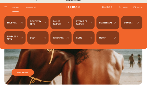
Source: fugazzifragrances.com
Lack of Direct Access to Featured Products
Many users visit ecommerce websites with the intention of making a purchase. Nevertheless, it’s important to note that not all web visitors are ready to convert. In fact, research suggests that moving through the sales funnel requires multiple brand touches.
That’s why it’s extremely important to guide prospects through the buyer’s journey with a gentle and customer-centric approach.
One of the primary ways to do this is to invest in high-quality awareness-building content, which can introduce web visitors to key items in your offer.
However, don’t make the mistake of assuming how your audience will move through the buyer’s journey. That’s only going to increase their chances of becoming frustrated.
Instead, explore opportunities to make conversions intuitive and convenient.
Providing direct access to featured products is an exceptionally effective UX design strategy that can enable purchase-oriented actions from any area of your website.
For instance, the featured photos on the Pergola Kits USA website each link to the relevant product category collection page, making it super easy for potential buyers to find the perfect structure for their backyard, without having to dig too deep to find what they need.

Source: pergolakitsusa.com
Inadequate Search Features
About two-thirds of web users go straight for the search bar when landing on a site. Yet, the majority of websites don’t include a user-friendly search feature that facilitates proper product and content discovery.
This can be a huge source of frustration, primarily because many shoppers treat ecommerce platforms as tools for product discovery and research.
So, if you wish to boost the performance and conversion power of your site, consider introducing (or upgrading your existing) site search bar.
The one by Sewing Parts Online is a great example to take inspiration from, as it’s highly user-friendly and effective at guiding shoppers to the right item in the brand’s vast inventory. But, of course, you can also design your own version. Just do your best to incorporate relevant and powerful filters and to make each search result conducive to a conversion action.
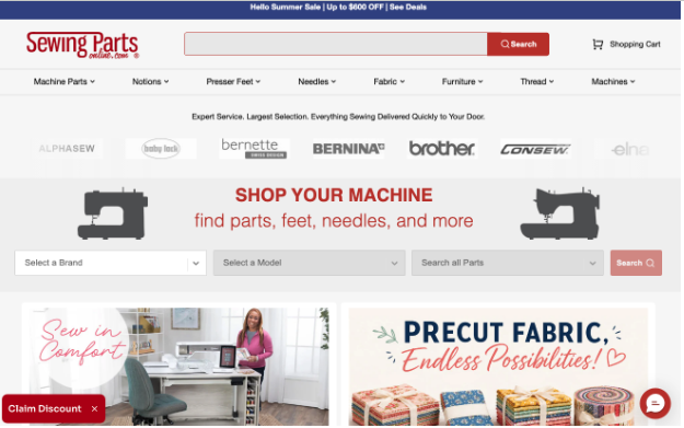
Source: sewingpartsonline.com
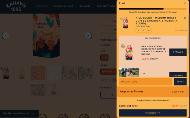
Lack of Cost Transparency (Not Just In the Cart)
According to web user behavior research, some UX mistakes come at a high price. One survey found that almost 40% of US shoppers gave up on purchasing due to high shipping costs.
Obviously, one of the best ways to improve ecommerce performance is to invest in customer experience elements such as fast, affordable shipping (and using website design to highlight customer benefits). But the mentioned statistic also shows that an enjoyable, conversion-inspiring browsing experience requires attention to detail — especially on subjects consumers deeply care about, such as cost and value.
A great way to reduce friction in your site’s UX (and encourage conversions) is to prioritize transparency regarding all things cost-related.
Kahawa 1893, for example, uses a pop-up cart that includes a free shipping progress bar. This UX element tells shoppers exactly how much they need to spend to qualify for free delivery, ensuring sufficient transparency while also encouraging higher average order values (AOV).
Source: kahawa1893.com
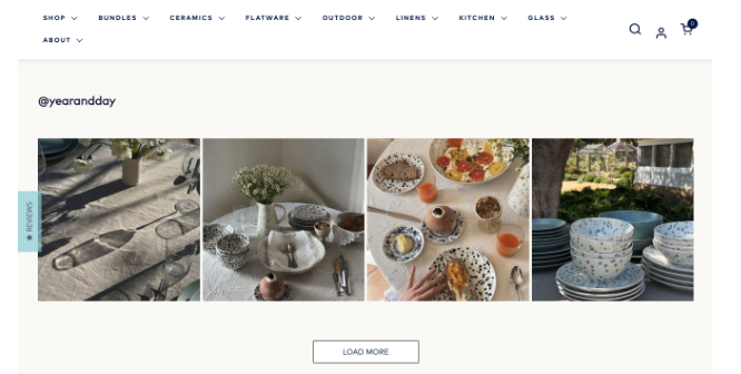
Insufficient Trust and Social Proof Elements
Finally, when investing in user experience design to boost ecommerce conversion rates, it’s essential to remember that almost all shoppers research products and brands before buying.
In fact, studies suggest that approximately 98% of consumers read product reviews when evaluating potential solutions to their pain points. Moreover, around one in two people wouldn’t buy from a business that has no reviews.
This data clearly testifies to the importance of brand and product trust in the buyer’s journey. And it further shows that trust marketing is an important aspect of performance-boosting web design.
The great news is that incorporating trust-building UX elements into your online presence can be relatively easy. In addition to trust badges, reviews, and other types of social proof, explore opportunities to highlight positive customer feedback through case studies or UGC.
Alternatively, source creator content from social media for an extra dose of trust-building, something that Year & Day does beautifully on its homepage.
Source: yearandday.com
Bottom Line
Great UX design doesn’t have to be complicated to drive ecommerce performance. It just needs to be user-centric in removing (or better yet, preventing) user frustration and facilitating easy, convenient movement through the sales funnel.
The UX design tactics outlined in this guide are all exceptionally effective at encouraging conversions. However, to get the best possible outcomes, base your design decisions on your specific target audience’s needs. That way, you will align your digital retail space with your ideal customers’ wants. You’ll also show your web visitors that you comprehend their unique expectations and that they can count on you to resolve their pain points with success and efficiency.