
This post will cover ways to best implement ads, focusing on a review of banner blindness and strategies that can be used to overcome it.
Included in This Guide
- Beginner’s Guide to Banner Blindness
- 5 Display Ads That Beat Banner Blindness
- Five Easy Tips to Beat Banner Blindness
- Seven Tips For Achieving Optimal AdSense Setup
- 7 AdSense Features You Should Know About
- These 5 Places On Your Site Probably Aren’t Monetized (But Should Be)
- How To Place Banners On Your Site: 11 Proven Layouts
- Ad Implementation Case Study: ChicagoTribune.com
- Do You Make These 5 Mistakes When Setting Up Ad Units?
- How To Make Money With Pop-Up Ads
- 10 Easy & Effective Blog Monetization Tips
- 3 Easy & Effective Forum Monetization Tips
- 5 Reasons Why Your Google AdSense and Analytics Data Don’t Match
Beginner’s Guide to Banner Blindness
When attempting to monetize a website–whether through display advertising, affiliate marketing, product sales, or some combination thereof–one of the most important things you’ll do is decide what goes where. While the type and quality of content that you have will go a long ways toward determining the volume and caliber of your audience, the manner in which you arrange those pieces will have a major impact on how much money you make from that traffic.
Most Web entrepreneurs don’t give much (if any) thought to the impact their layout decisions have on revenue. But it’s an incredibly important aspect of monetization. When it comes to websites at least, there are lots of different ways to put together the puzzle. Volumes have been written on site layout, banner blindness, and optimal positioning.
It’s easy to get very advanced very quickly on this topic, but we’ll start out here by exploring some of the more elementary elements. And to do so, we’ll rely on a visual representation that’s an oldie but goody:

If you’re already familiar with this image–and everything it represents–you might be a bit too advanced for this post. But if it’s new to you, here’s the basic overview.
This is what’s known as the AdSense Heatmap (or some variation on that name). It represents a hypothetical website, segmented into various sections. The colors associated with each section indicate visibility to visitors and the concentration of clicks. Because AdSense works primarily as a pay-per-click ad network, clicks generally translate into revenue for the publisher. The darker areas represent sections where the human eye is drawn; content in these sections will generally be seen most frequently, and generate the most clicks.
This is obviously a generic representation; not every website will fall into this segmentation (actually, most won’t) and there are different things that can be done to ensure that certain segments attract visitors’ eyes (visual cues, etc.). So think of this as a rule of thumb–a starting point in your quest to conquer banner blindness. The implications of the heatmap above are probably enough, but here are a few key takeaways:
Left Is Right
This sentence explains why the left side of the page gets so much more attention than the corresponding placements on the right. You read it left to right, which is how our brains are conditioned to consume content thanks to the nature of the English language. Our gaze starts left and gradually shifts right, but our focus wanes as we move across.
Our second horizontal pass at the content has an even shorter attention span, and before long we don’t even bother to take in what’s on the right side of the page. This is what’s known as the “F pattern” for the shape it forms if we map where time is spent:
![]()
So here’s the key takeaway: the left side of your site will get much more attention than the right. Accept this as fact, and use it to make our human nature work for you by positioning key sections and calls-to-action where they will be most visible.
Height Disadvantage
It’s a common thought process to want to put your best and most important calls-to-action (whether an AdSense ad or something else) at the very top of the page. That’s the very first thing people will load, meaning that it will achieve high visibility and a high click rate…right?
In reality, the top of the page (where many sites using display advertising feature a 728 x 90 leaderboard) is often overlooked. This is a great example of banner blindness; our Internet-frequenting brains have been conditioned to expect an ad at the very top of the page and the content we’re looking for down below. So we don’t dwell long at the top of the page, and instead scroll down almost immediately to get to the good stuff. Take note next time you load a new website; you’ll find yourself scrolling almost as soon as you hit “enter.”
Before you’ve been on the site for even a second, the leaderboard may already be out of view, as you’ve moved on to the meatier part of the page and started to digest the real content.
Hot Spots
A lot of website owners assume that content and ads should be like church and state–always separate. But a look at the basic viewing patterns may indicate otherwise; notice the attention paid to the meaty middle part of the page, where the desired content is usually found.
Not surprisingly, more sites are starting to feature ads smack dab in the middle of their content, ensuring that it will get increased visibility and clickability. Here’s an example from the ReelSEO.com:

Ads positioned within “hot spots” that traditionally include only content can perform very well because they are more likely to be viewed (and therefore more likely to be clicked) than ads that live in sections of the site where the eye rarely travels.
Make Orange = Green
We’ve been lightly implying above that the high visibility areas of your site (i.e., the orange segments on the heatmap) should be home to advertisements and link units. That’s a good idea for some publishers. And it’s a very bad one for others. With this limited amount of “prime real estate” there are probably a lot of goals you want to accomplish: generating ad revenue, getting social shares, converting newsletter subscribers, etc.
The high visibility areas of your site represent the best opportunity to highlight your primary goal. For some, that will be making money from AdSense. For others, it will be gaining a Twitter follower or newsletter sub, or perhaps featuring an affiliate marketing or e-commerce link.
Bottom Line
If you have created great content and built up a loyal and recurring audience, you’re well on your way to operating a profitable website. Along the way you may have overlooked the “physical” set-up of your site; as you turn your focus towards monetization of existing traffic, the boring details of site layout can become extremely important.
Back to Top
5 Display Ads That Beat Banner Blindness
Banners and towers–such as 728 x 90 leaderboards and 300 x 250 medium rectangles–have historically dominated the world of online advertising. Many major campaigns still consist primarily (or perhaps exclusively) of standard IAB ad units. But as advertisers and publishers alike have become more sophisticated in measuring and optimizing the reach of online marketing campaigns, the market for sponsored placements has evolved rapidly.
Alternative placements are rapidly gaining popularity, as advertisers embrace them as creative opportunities to promote their brands and publishers gain the flexibility needed to make them happen. The appeal is simple; the online audience has become so accustomed to seeing standard-sized ads in the regular locations that they now automatically ignore them and focus instead on the content they came to the site to consume.
In other words, they’re banner blind–which can be a bad thing if you’re an advertiser looking to get your messaging across through banners. Here are just a few examples of creative placements that helped advertisers get their messaging across and publishers earn their fees.
“Skinned” Homepages
Here’s a skinned homepage on IMDb.com, a popular site containing information about movies past and present. Note that there’s also a “standard” unit (300 x 250) with a similar look and feel:

Why It Works: This messaging leverages the trust of a well-known brand (IMDb), allowing the advertiser to capitalize off of the generally positive feelings visitors have towards the site. (I.e., they trust and respect IMDb.) Because people like IMDb and trust the information they find there (including a ten-star rating system), this placement creates the impression that this movie is endorsed by (or at least associated with) a trustworthy site.
Here’s another example from BleacherReport.com, a popular sports website that regularly sells takeovers to advertisers:
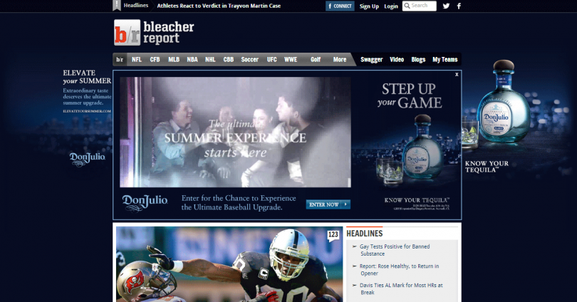
Why It Works: Between the skinned homepage and the expandable leaderboard, the ads here insert themselves where eyeballs are used to seeing sports-related content. It takes you a few seconds to realize that the area you’re looking at (right below the nav bar with “NFL” etc.) isn’t actually sports content but rather an ad for tequila. You might even temporarily forget where you are (i.e., what you came to the site for) and start thinking about tequila.
Finally, here’s a screenshot of AskMen.com, a site that publishes reviews of items for men such as watches, cars, and shoes:

Why It Works: This placement is perhaps the least effective of the three, though it still commands attention nicely. We’re not used to seeing content the entire width of the screen, so the eye is inevitably drawn to the borders to see what’s clogging up this often unused space. The clashing color schemes makes this page a bit jumbled and it’s a bit strange that it also includes ads for a competing, less luxurious automobile–but it’s a great way to focus attention on the advertiser’s messaging nevertheless.
Welcome Screens
Welcome pages are temporarily presented to visitors when they attempt to navigate to a site, eventually forwarding them on to the desired content but highlighting an advertisement before completing that delivery. Here’s the page you’ll get whenever you navigate to Forbes.com: a “welcome page” that includes a quote as well as a prominently-positioned advertisement:
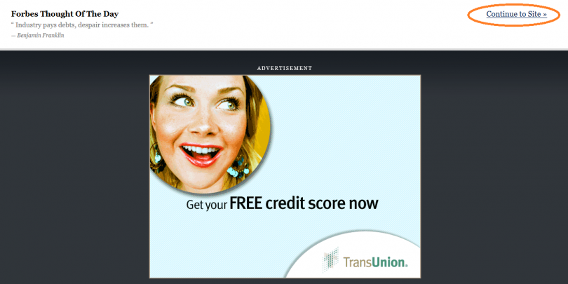
Why It Works: By virtue of being one of only two pieces of content on the page (the other being the quote) this messaging ad is much more likely to be seen than a similar ad appearing alongside articles, pictures, and (of course) other ads. There’s also a sense of leveraging the brand of the trusted publisher–associating this advertiser as somehow affiliated with, or being a sponsor of, the high quality content the visitor is seeking out. Finally, we’ll close out with an attempt at unique display advertising that fails.
Here’s a screenshot from TheStreet.com, a popular investing site:

Why It Doesn’t Work: This one is pretty obvious; there’s no ad to be seen! The welcome screen automatically forwards to the home page after a preset period of time (seems to be about 3 seconds), but that doesn’t give the ad enough time to load. Instead, the publisher ends up serving up a blank page, disrupting and confusing the user experience, and not making any money off of it in the process.
Bottom Line
Banners and towers aren’t dead–not by a long stretch of the imagination. But the landscape is definitely shifting towards more disruptive and creative ad placements. If you’re a publisher looking to distinguish your property or generate new money-making opportunities, getting ahead of the curve here can give you a big advantage.
Back to Top
Five Easy Tips to Beat Banner Blindness
Many website owners could learn a thing or two from master chefs. The premier culinary awards (as well as the countless reality TV shows) now consider not only the taste of the food in their rankings, but the presentation as well.
A delicious dish presented poorly loses some of its appeal, while a mediocre meal presented in a creative and visually appealing way is likely to outrank a similar course delivered in a boring, unoriginal arrangement. Many websites focus significant energy on cooking up great content, while overlooking the presentation component that plays a major role in determining their bottom line.
Just like in a cooking competition, a great product presented poorly or awkwardly will cause you to come up short (in this case, of your full earnings potential). Here are five tips for beating banner blindness, coming up with an effective site layout, and maxing out your site’s monetization potential.
Tip #1: Know Your Hot Spots
One of the basic rules of the Web is that not all positions are created equal. After multiple decades of Internet access (and millennia of reading), humans have become creatures of habit when it comes to digesting content. As a result, certain areas of your site will be inherently more popular than others–not because of what they contain but because of where they’re positioned. Here’s the most basic illustration of how we tend to consume the content on web pages, with darker sections illustrating sections that get more attention.

Here’s another helpful illustration to understand how visitors to your site are consuming your content–where their eyes tend to focus and which parts of the page are most likely to be overlooked completely:
![]()
So when placing your ad units, be sure to place some in areas of high visibility, namely just above and to the left of your primary content, or even within your primary content.
Tip #2: Taste the Rainbow
One of the easiest and most effective ways to highlight the content you want your visitors to see involves tweaking color schemes. By using colors that “pop” from the rest of your site design, you may be able to draw attention to key features–such as a newsletter signup or social share box. Conversely, you may want to do everything possible to have ads blend in with the rest of the site; the more they look like your original content, the more likely they are to get clicks. In other words, depending on your exact objective, you may want to embrace color schemes that either blend or clash with your overall site design.
For example, if you’re trying to improve click rates on text ads running on your site, you’ll generally want the color of the ads to match colors of links and blend in with the other content on your site. Our guide on AdSense experiments walks through some of the basics of experimenting with different text colors in order to improve click rates and earnings.
Tip #3: Use Creative Placements
Generally speaking, you can overcome banner blindness by implementing layouts that are uncommon and come as a bit of a surprise to your audience. Here’s one of the blindness-beating placements we recently highlighted, from BleacherReport.com:
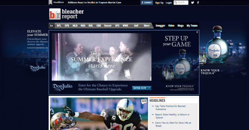
It’s hard to escape the Don Julio ads; they take over the page and demand recognition. Another “disruptive” practice can involve interrupting content with ads or calls-to-action prompting internal goals (such as a newsletter signup). Here’s another example of that:
Tip #4: Spy on Your Visitors
The NSA and its PRISM program can teach us something about beating banner blindness. There’s a lot that you can (legally) do to spy on your visitors and get a better feel for how they’re engaging with your site. The conclusions you draw from this data may help you to restructure elements of your site to drive visitors to the high-value segments.
Crazy Egg is perhaps the best known app for gaining insights into where your visitors are clicking (and, perhaps more importantly, where they’re not), but features in Google Analytics can give you similar stats.
Tip #5: A.B.E. (Always Be Experimenting)
There’s only so much reading about banner blindness and optimal site setup that you can do. Because each site and audience is so unique, your gut can only carry you so far. Eventually, you need to start testing out different implementations to see which one more efficiently achieves your specific objectives (if you’re looking to boost AdSense earnings, we have several ideas for experiments to run).
Programs like Optimizely (and many others) make it easy to conduct split tests on your site–for example, moving an ad unit up and a newsletter signup box down–and measuring the impact on clicks.
Bottom Line
Many bloggers and publishers don’t give much thought to arranging their site; they assume that because they know where the best content and most valuable features are, their audience will as well. Put yourself in the shoes of someone with a short attention span who’s never been on your site before, and imagine how they would consume the content you’re presenting. The structure and visual layout of your site can have a major impact on your bottom line; those who understand the psychology of online consumption and design their site with the audience’s tendencies in mind will enjoy the revenue that eludes many others.
Back to Top
Seven Tips For Achieving Optimal AdSense Setup
OK, so you’ve reviewed your options for monetizing your website and decided that display advertising is one of the channels that has big potential. Great. Now what? Once you’ve signed up for AdSense, it’s time to start thinking about how exactly you’re going to incorporate ads into your site. Below are seven tips for getting AdSense up and running as quickly and efficiently as possible.
Tip #1: Use The Most Common Units
When you’re creating ad units within AdSense, you’ll be presented with several different dimensions. At the top are the “Recommended” sizes: 300 x 250, 336 x 280, 728 x 90, 160 x 600, and 320 x 50. Below are several other options for ad units, both big and small.

Size most definitely matters when setting up your AdSense units, and the five mentioned above are recommended for a reason. They are the sizes most commonly created by advertisers. Sticking to these standard sizes will increase your fill rate and ensure that you’re able to serve the ads that will drive clicks and earnings. Here’s the IAB’s official display advertising guidelines–note the Universal Ad Package:

When you’re designing the layout for your website (more on this below) stick to the most commonly used sizes when it comes to your ads.
Tip #2: Use Multiple Sizes
When setting up your ads, be sure to include a bit of variety in your sizes. Building a page layout that features only 300 x 250 ad units, for example, can be a mistake. It will reduce the universe of ads from which AdSense is able to pull when attempting to fill your site, which means you might miss out on the opportunity to serve ads that would drive high CTRs and earnings. Moreover, failing to diversify your inventory can bite you down the road if you get an inquiry from an advertiser looking to pay premium CPMs to run a campaign that only has creative in one size.
Advanced Tip: If you have plans of selling ads directly to advertisers at some point in the future, make each page on your site identical in terms of the number of ad units it includes. Ideally, each page should have the same ad units in the same places. Down the road, this makes the inventory management process much easier.
Tip #3: Place Your Ads In Hot Spots
The most challenging part of setting up ad units on your website is figuring out exactly where they’re going to go. This is often a balancing act; you’ll want to come up with a site design that (literally) puts your ads in a position to succeed while also delivering a clean layout that provides a positive user experience (i.e., a site that just looks good).
Below is the official AdSense heatmap, which conveys some general rules of thumb for which areas of your webpage are most likely to attract eyeballs. The darker the zone where you place your ad units, the higher your CTRs and AdSense earnings will generally be. Decisions about where to position ad units should be considered in conjunction with the two above; the decision of where to place your ad units is of course linked to the decision about how big your ads should be. If you want more specific examples of layouts that work with AdSense, Spencer Haws has some good examples up at Niche Pursuits.
Tip #4: Watch Out For Pandas
Within the last few years Google introduced its page rank algorithm (affectionately known as “Panda”) as part of its shift toward visual search technology. Basically, the update was designed to penalize sites that displayed primarily ads “above the fold” and pushed any valuable content lower on the page. So if you came up with a layout that features your ads front and center while relegating the valuable content to below the fold, you might want to think again. Below are the examples Google gives for layouts that highlight content (unlikely to be penalized) as well as one that pushes content below the fold (likely to be penalized):
Scott Blanchard of ClickBump has a great summary of what exactly the Panda update means for setting up your ads, along with a few examples of what to avoid.
Tip #5: Put Some Thought Into Color Schemes
As we highlighted in our recent post on ways to boost AdSense earnings, playing around with the visual presentation of text ads on your site (assuming you opt to show text ads) can be a high value activity. If you’re planning to show text ads, spend some time coming up with a layout that either blends with, complements, or contrasts with your site. Without your elections, AdSense will set you up with the “Google default” color scheme, with black texts, blue links, and a dark green URL.
John Saddington at TentBlogger has a good summary of the three general strategies. The official AdSense help guide also shows us some examples of the three approaches:

Once you’re up and running, you’ll want to come back and experiment with different mixes of text and color. But it won’t hurt to put some thought into this at the beginning.
Tip #6: Know Your Limits…And Push Them
If you’re using AdSense, you must be aware of the limitations imposed by Google. Specifically, there are caps on the number of ad units you’re able to have on your page:
- 3 ad units
- 3 link units
- 2 search boxes
You’ll need to comply with these guidelines in order to get approved, and you’ll want to be sure to remain in compliance afterwards (or risk getting booted). But AdSense provides plenty of opportunities (eight to be exact) to generate revenue on each page. The limits above include three “link units” and two “search boxes”.
A lot of website owners overlook these potential monetization sources when setting up ad units–which can obviously rob them of earnings. A search box is simply a custom search engine that allows your users to look for content within your site. Along with the results from your site, Google will display some third party ads:
Link units are smaller ad units (many of them are just 15 pixels tall) with text-based ads. When placed at the end of your articles or other content, these link units can generate impressive CTRs and potentially boost your overall CPM by $1 or more. Here’s an example of a link unit at the top of a page:

Tip #7: Plan Ahead For Experiments
A critical component of any website monetization plan is experimentation. No matter how much thought you put into it, your first layout probably won’t be the strategy that maximizes your AdSense earnings. But don’t worry; you’ll get there eventually–assuming you experiment regularly with different strategies and layouts.
Wherever possible, do a favor to your future self and make it easy to rearrange the sections of your site. If you’re adding a 728 x 90 leaderboard at the top, think ahead to an experiment that may involve removing that leaderboard and putting another unit below the fold. Or set aside real estate that may be used later as an alternative position for a link unit. There’s no exact set of directions for following this tip; just think ahead, and do your best to make your site layout as flexible as possible.
Bottom Line
Not all website layouts are created equal, particularly when it comes to the potential to generate AdSense earnings. Decisions that may seem minor can end up having a big impact on how much money you ultimately make from display advertising. Follow the tips above to put your site in a position to succeed.
Back to Top
7 AdSense Features You Should Know About
If you own a website that generates a fair bit of traffic, odds are you’ve come in contact with Google AdSense at some point in your online career. AdSense is one of the most widely used monetization opportunities; the ad network is used by sites both big and small to make money through display advertising. Most AdSense partners quickly become addicted to their account, checking in multiple times each day to get an update on their recent earnings. If you’re looking to venture beyond the dashboard, here are some cool reports and features you might want to check out.
Feature #1: Policy Violations
This report shows you any violations of the AdSense terms of service identified on your site. If you have inadvertently broken the rules, you’ll have an opportunity to remedy the situation before you’re kicked to the curb. If anything fishy has been detected, this report will give you the details on what specific term you’ve violated and what needs to be done to correct it.
How to Get There: Account Home >> Policy violations

Feature #2: Allow & Block Ads
AdSense partners can prevent certain ads from appearing on their sites by simply entering in the URL of the undesirable site. There are multiple reasons you may want to prevent a specific ad from appearing. It might be creative that you view as low brow or spammy, and you simply don’t want that advertiser associated with your site. Or it may be an advertiser with whom you’re trying to establish a direct relationship, and you want to force them to deal with you instead of buying through a network.
You’re limited to blocking 500 individual URLs, which should be plenty for most publishers. Note that you’ll be in violation of the terms of service if you click on your site’s ads to get the URL.
How to Get There: Account Home >> Allow & block ads

Feature #3: Ad Styling
When you kick off your AdSense account, you’ll begin by showing the default color schemes that are generally the most effective. But you’re certainly not stuck with these colors; in addition to some other “off-the-shelf” opportunities, AdSense lets you create your own ad styles to match (or conflict with) your specific site. (See also: Five Easy Tips to Beat Banner Blindness.)
How to Get There: Account Home >> My ads >> Ad styles
 If you’re looking for some tips on testing out new layouts for your AdSense ads, check out these articles we’ve written on the topic:
- 8 Tips To Run an Effective AdSense Experiment
- Seven More AdSense Experiments To Boost Your Earnings
- Three Easy Ways To Make More Money With AdSense
Feature #4: AdSense Academy
If you’re looking for tips on improving your AdSense performance and general best practices, there is a ton of information available within the AdSense interface. The Inside AdSense Blog is a tremendous resource for learning more about display ad opportunities, and the AdSense Academy can help beginners get up to speed.
Feature #5: Targeting Report
The most popular reports in AdSense are probably the ones that show earnings by ad units and by site, but another insightful summary shows how advertisers are reaching you. This report breaks out the ads that your site displays by targeting type:
- Contextual: Google reviews keywords and other factors about your site to match it with relevant ads.
- Interest-Based: Advertisers have selected broad based interests (such as “travel” or “fashion”) that include your site.
- Placement: Advertisers who specifically target your site.
It can be good to know if advertisers are specifically picking your site in their planning process; if so, this can increase competition for your ad inventory and drive up earnings.
How to Get There: Account Home >> Performance Reports >> Targeting types

Feature #6: Custom Search Engines
In addition to traditional banner ads and link units, AdSense allows publishers to implement a “white label” search engine that can generate additional revenue. Google basically indexes your site, and displays search results containing only your content whenever your users enter a term into your site’s search box. On the search results page, ads will display alongside the actual search results (similar to any Google search). Search traffic generally has a relatively high CTR, meaning that the search results page often has one of the highest RPMs on the site.
How to Get There: Account Home >> My ads >> Search

Feature #7: Fill Rate Report
This report is informative primarily for the indication of coverage your AdSense ads are receiving. In other words, this will let you know if AdSense is delivering ads for each request your site makes, or if it’s unable to fill completely (in which case you’re probably showing a blank space where an ad could be). If your fill rate on standard display ads (such as 300×250 and 728×90 placements) is significantly less than 100%, you might be missing out on some easy AdSense earnings. (Check out our list of the most common reasons why AdSense can’t fill your ads.)
How to Get There: Account Home >> Performance reports >> Ad units
Bottom Line
AdSense puts a tremendous amount of information at your fingertips; if you have the time and patience to sort through all the various statistics and features, there can be a huge opportunity to optimize your site setup and immediately boost earnings.
Back to Top
These 5 Places On Your Site Probably Aren’t Monetized (But Should Be)
Publishers and bloggers working to monetize their existing traffic tend to focus primarily on display advertising, as this monetization channel generally represents the largest and easiest way to earn revenue. There are plenty of opportunities on the display advertising side of things; from optimizing your AdSense settings to experimenting with alternative ad networks and even attempting to establish direct relationships, there is no shortage of work.
But there are also many opportunities beyond tinkering with settings on your leaderboards and rectangles; traditional display advertising is only one of many monetization methods available. Below we take a look at several places on a website where publishers have an opportunity to squeeze additional revenue from their existing traffic.
Post-Article Real Estate
There are countless sites out there willing to pay for traffic; if you have the ability to funnel new visitors to them, you can get compensated to do so. One of the newer (and more effective) methods involves “sponsored content” links that direct out to third party sites. You’ve probably come across these on many top tier websites, such as CNN.com. Here’s an implementation from ESPN.com, one of the largest sports websites in the world:
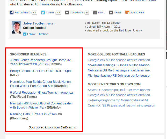 The publisher (ESPN) gets compensated for each visitor they send to one of the content sponsors (in this case, Cambio, MTV, etc.). There are a number of partners who offer publishers a way to monetize via these “sponsored content” links, including OutBrain and Taboola.
This implementation may be particularly worthwhile on pages that experience a high exit rate–meaning visitors tend to leave your site from that page. Obviously you’d prefer to keep your audience on your site for as long as possible, but if they’re likely to depart from a certain URL you might as well make a bit of money in the process.
Captcha
Many sites use an anti-spam verification process to allow visitors to complete a process such as commenting or registering for a free membership. CAPTCHA, which involves a user entering in a visible code, has become a popular way to keep bots out of unauthorized areas. But most users of this technology don’t view it as a monetization opportunity, even though it presents a unique opportunity to serve ads to a captive audience.
Publishers whose CAPTCHA gateways receive heavy usage might want to consider turning this part of their site into a moneymaker by partnering with one of the sponsored CAPTCHA companies that have popped up in recent years. The premise here is pretty straightforward: instead of entering in a string of random characters, visitors will be prompted to type out a company tag line or slogan.
Here’s an example from Ticketmaster:

Similarly, here’s another implementation from Confident Technologies, which prompts users to click an image instead of typing out a string of text and numbers:

For more on the economics of sponsored CAPTCHA, check out our interview with a Confident Technologies exec.
Search
If your site contains a search box, there’s an easy opportunity to both improve the functionality of the search function and make a bit of money in the process. Google’s Custom Search Engine program lets you have a mini version of Google that will show useful results from your site only as well as advertisements to your visitors. Similar to regular AdSense, publishers get a cut of any revenue generated from these ads.
Here’s an example from investing site TheStreet.com; note the ads displayed above the in-site search engine results:

Ads displayed on search results pages often generate RPMs significantly higher than traditional ad units. This makes sense intuitively; users of the search function are actively looking for more information on a particular topic, and therefore are much more likely to click on a relevant link shown to them as a result of the search.
Of course, the volume of impressions is relatively low since only a small percentage of your visitors are using your search box. Monetizing your search function won’t result in a huge increase in earnings, but will definitely unlock a new revenue stream and boost overall income.
Link Units
In addition to allowing up to three ad units per page, AdSense also allows publisher to include multiple “link units” on each page. These link units are essentially text ads that display relevant topics, and direct to a page containing multiple ads when clicked. Here’s an example of a “landing page” that a link unit sends me to, including both topics related to the site I was on (a tech blog) as well as other topics Google knows might interest me (such as investing and Chicago-based businesses):
 Link units generate revenue not on the first click, but when the ads on the “landing page” are clicked (which is why I was able to grab the above screenshot without committing “click fraud”). Many publishers will be pleasantly surprised by the potential earnings opportunity from link units. As a rule of thumb, link units generally have an RPM of $0.50 to $1.00, but double-digit RPMs aren’t unheard of if link units are positioned to achieve maximum visibility. Perhaps the easiest implementation involves adding a 728×15 link unit directly above or below an existing leaderboard ad unit; it fits easily into that space, and will begin boosting earnings immediately.
![]()
Second Tier Inventory
Display ad optimization is often approached as a zero-sum game, at least in terms of the number of units that can be used. Because AdSense allows only three ad units per page (and other networks have similar limits), publishers quickly get to the point where adding a unit to a new position on a page requires removing one from somewhere else.
Many publishers unnecessarily tie their hands by only utilizing one ad network on their site. If you have additional real estate on your page that you feel could be monetized by a display ad, but are at your limit for ad units on a page, it might be time to try using an additional ad network to complement your primary display advertising solution. For example, if you currently use AdSense you may want to also create an account with the Yahoo! Bing network or any of the other top ad networks.
Bottom Line
If you’re monetizing a site only through traditional display ads, it’s likely you’re leaving some money on the table. In recent years monetization options have expanded significantly, with new technologies and strategies opening up new new earnings avenues. While the opportunities highlighted above might not make you rich overnight, they represent opportunities to squeeze more revenue out of your site and boost your bottom line.
Back to Top
How To Place Banners On Your Site: 11 Proven Layouts
For publishers and bloggers hoping to monetize their traffic primarily through display advertising, the layout of a website becomes a very important strategic decision. In addition to deciding which ad units to use, you’ll need to figure out where each should be positioned in order to maximize revenue without annoying visitors or detracting from the site experience.
Below we profile several actual sites with simple and effective ad layouts. We focus on layouts that use the most common ad units (728×90 leaderboard, 300×250 medium rectangle, 160×600 skyscraper, and a 300×600 large rectangle) and relatively simple structures that can be easily replicated.
Read more on How To Place Banners On Your Site: 11 Proven Layouts.
Back to Top
Ad Implementation Case Study: ChicagoTribune.com
In a break from our normal monetization tutorials, we’ll focus instead today on a real-life example of aggressive monetization in action. We recently spent some time reviewing the website of our hometown newspaper, the Chicago Tribune, to provide some insights on how one of the largest publishers in the world attempts to monetize its online traffic. As you may have heard, the newspaper industry isn’t exactly thriving; with sales numbers steadily declining, there’s been a major push from these publishers to squeeze as much revenue as possible out of their websites. So let’s dive in to ChicagoTribune.com and take a look at some of the tools and strategies they’re using to monetize their substantial traffic base.
1. “Standard” Ad Units
The Tribune site features a number of “plain vanilla” ad units; in addition to an expanded leaderboard, there are several 300×250 ad units in the right rail.

2. Mini Buttons
In addition to the more standard rectangles and leaderboards (as well as some 160×600 ad units on article pages), the site also features some smaller buttons above the fold that reflect sponsorships sold to advertisers. Notice the that the “Breaking News” is sponsored by Xfinity while Sears has a sponsored placement for local ads. These ads are exclusive or semi-exclusive, meaning that a single advertiser or a small handful of advertisers owns all of the inventory. (The image below shows a Sears button; Kmart ads also rotate through that same spot.)

3. Special Advertising Sections
In addition to the ad units that clearly stand out as advertisements, the Tribune site includes several sections dedicated to more “native” advertisements where sponsors are able to host their branded content on the Tribune’s website. The appeal of these types of placements (from the advertiser perspective) is that they look more like organic content and less like advertisements. Here’s the collection of “special advertising sections” in the site’s right rail:

Clicking through on one of these sections takes visitors to a branded content hub, complete with standard ad units and a welcome screen. Also featured are several pieces of non-news “branded content”. In other words, that means soft stories such as Let’s Hear it for Bears Fans – from Bears Fans!

4. Today’s Flyers
The Tribune site features a “Today’s Flyers” section dedicated to highlighting goods available for purchases on a sister site, ChicagoShopping.com. This likely isn’t an affiliate relationship since there’s common ownership between the two, but could theoretically be structured that way if an unrelated party was involved. Under that type of affiliate relationship, the Tribune would receive a commission for any sales generated by visitors clicking through to the shopping site.

5. Text Ads In Articles
In addition to the traditional ad units mentioned above, the Tribune utilizes Google AdSense to serve text ads within its articles. There are a few different implementations they use to get ads within the articles, fitting them in between the title and the end.
Here’s another that positions multiple text ads right aligned with the content of the article:
 Here’s one final ad implementation. This one isn’t AdSense, but rather a service called Criteo that serves up relevant and targeted ads across the Web. This service works by helping e-commerce companies (in this example, Hotels.com) reach people who have been on their site before:
6. Custom Search
You’ll notice the search box in the top right of the site, which indicates straight away that it’s using the Google search engine functionality:

If you search for a term using that box, you’ll land on a page that includes relevant articles from the Tribune. You’ll also see relevant Google ads, served above the results. The publisher gets a split of that revenue:

7. Pop Up Ad Units
The Tribune also uses a monetization technique that most visitors find annoying but that is extremely effective: ads known as “pop ups”. These ads appear in a new window when visitors click on a link to a story from the home page, interrupting the user experience and getting the advertiser message front and center. Below is an example from the site. (This ad opens in a new window.)
Bottom Line
The Tribune is aggressive in its attempts to monetize its Web traffic, as are many newspaper publishers in 2013. The tactics used by this site may be considered a bit overboard for some publishers, but a review of the techniques that are clearly working for them will hopefully help to inspire some ideas for your own smaller Web presence.
Back to Top
Do You Make These 5 Mistakes When Setting Up Ad Units?
When setting up a website that will be monetized primarily through display advertising, there are limitless implementations that can be used. From the number of ad units to the color scheme to the positioning of the ads, you’ll have plenty of important decisions to make.
While the optimal setup for each site will depend on specifics such as the niche and type of content, there are some mistakes that can be avoided to get your experiments off on solid footing. Below are some of the most commonly made mistakes when setting up display ad sites.
Mistake #1: Give Your Ads Bad “Real Estate”
Nothing will determine the success of your display advertising monetization more than the decisions you make when coming up with your site layout. You can test and tweak all you want to optimize performance, but you can’t change the habits of your visitors. Ad units positioned in highly visible sections of the site will tend to perform well (i.e., generate high click-thru rates and earnings) while those positioned in sections where they’re rarely seen will struggle. Relegating your ad units to second-tier “real estate” on your site is a mistake.
Many bloggers and publishers feel a need to hide ads below the fold or put them in out of the way places, perhaps out of fear of appearing to be overly corporate or focused on monetization. But there’s a happy medium that allows you to position ads in highly visible places where your visitors will see them without going overboard and destroying the user experience. For specific examples, see our feature on effective ad unit layouts used by actual publishers; you’ll get a good feel for strategies that manage to walk that line.
Mistake #2: Use Non-Standard Units
When you’re contemplating a layout for your site and working in ad units to the design, it’s highly recommended that you focus only on the most common ad units. The IAB identifies a set of “standard” ad units as well as a handful of “rising stars” that are expected to become increasingly popular in coming years. You’d be wise to familiarize yourself with the ad units below, and you’ll generally want to include only ads from the Universal Ad Package on your site:

It’s important to incorporate the most commonly used ad units into your page because doing so will improve your earnings potential. If you’re using an ad network, you want your site to be able to choose from the largest possible inventory of ads, giving the network the maximum number of chances to match your site with a unit that is going to convert and earn you money.
As an example, a 120×40 placement may be able to be filled by ads from 10,000 different advertisers. A 160×600, on the other hand, may be able to be matched up with 50,000 different advertisers. The more options you give yourself, the better your odds of serving relevant, clickable ads. For example, ideally you’ll be able to turn a 300×250 ad unit into a 300×600 ad unit to test the increase in RPM (or in response to advertiser demand if you’re selling directly).
Mistake #3: Violate the Terms Of Service
This sounds extremely basic, but every day publishers get kicked out or banned from advertising programs because they fail to comply with the terms of service set forward by networks. Whether it’s intentional or not doesn’t matter, and the consequences can be severe if you’re no longer allowed to participate in some of the most profitable ad networks.
For example, AdSense specifies a number of conditions that must be met by its partners, including limits on the number of ad units per page (three, along with three link units), the manner in which advertising sections are presented, and other facets of a site. Be sure you’re familiar with what’s allowed by any ad network you plan to use when setting up a site; a little homework up front can save you some major headaches if you happen to break any of the conditions.
Mistake #4: Synchronous Loading
Each ad unit you position on your page has the potential to increase the amount of time it takes for your page to load, which can obviously frustrate visitors, reduce pageviews, and negatively impact your revenue. While some decrease in speed in unavoidable, there are strategies for making the addition of ad units as painless as possible.
AdSense now offers an asynchronous version of its ad tags. Using the asynchronous tags can improve latency because the ads will load in parallel and will not prevent other sections of your site from loading. As a result, if ad units are taking a long time to load it won’t prevent visitors from seeing the other sections of your site. BloggerSentral has a good tutorial for implementing these asynchronous ad tags using Blogger; Google also has a detailed guide to getting this up and running.
Mistake #5: Sub-Optimal Loading Sequence
Even if you have a lightning fast connection and never experience any issues with ads loading on your site, it’s important to remember that a meaningful portion of your audience may have a much slower experience. In addition, the way you set up the “guts” of your site can have an impact on the monetization of your display ad units. AdSense serves ads in the order that it comes across them in your HTML.
Because the “fill rate” on AdSense ads might not always be 100%, you’ll want to have your best ad units (i.e., the ones that have the highest revenue per thousand impressions served) lined up first in the code of your site. That will ensure that these ads get higher fill rates (meaning fewer occurrences of blank space) and also get served the best ads (meaning those most likely to earn revenue on your site). Google has some helpful guides on this topic if you need assistance figuring out exactly how to set this up.
Bottom Line
When you’re attempting to monetize a site via display advertising, it pays to put some thought into the technical implementation of the ad units. It may not be the most exciting task you face as an entrepreneur, but some of these boring details can have a big impact on your success down the road.
Back to Top
How To Make Money With Pop-Up Ads
For websites that rely primarily on display advertising to generate revenue, there are a number of opportunities to squeeze a bit more juice out of existing traffic. We’ve covered a number of these topics previously, including link units, sponsored CAPTCHA, and affiliate marketing. This article explores another option that has been proven to add to the top line–but that has some potential downside risks as well.
Read more on How To Make Money With Pop-Up Ads.
Back to Top
10 Easy & Effective Blog Monetization Tips
Many bloggers who have managed to build up loyal readers and a meaningful stream of traffic to their sites find themselves struggling to translate those viewers into revenue. The initial steps in monetizing a blog–which generally include throwing up a display ad or two–get that initial stream of cash flow running. But the yield from that first step is often much lower than many anticipate and would hope for.
In this section, we’re outlining some useful exercises in “phase two” of blog monetization–after you’ve taken the first step but long before you consider more advanced and time consuming practices such as direct ad sales or a subscription product. There are, of course, opportunities to optimize your earnings by experimenting with different Google AdSense layouts and settings. But those changes take time, and certainly aren’t guaranteed to make you more money. (Some of the changes may even lower your earnings.) Below we’ll focus on relatively easy changes that have a high probability of making your blog more money.
1. Add More Ads
At the risk of starting with the incredibly obvious, we’ll point that many blogs have the potential to make more money by adding more advertisements to their site. Though the threshold that your audience will tolerate depends on a number of factors, it’s often reasonable to include three or more ad units on a page. (AdSense and some other networks stipulate a maximum of three ad units per page.) If you only have one or two, max out the allowance you’re given and you will likely see an immediate jump in revenue.
2. Get Disruptive With Your Ad Units
With long form content, you’ll have the (potentially profitable) opportunity to insert advertisements into articles. Doing so makes it hard for your visitors to ignore them, and increases the likelihood that they’ll interact with the ads (i.e., click on them and generate revenue for you). Experiment with some “non-traditional” ad units that can fit between paragraphs in your blog posts, as opposed to in the dedicated real estate around the edges of your site. Specifically, AdSense lets you create and implement 468×60 and 234×60 banners that will fit into the content section of most blog posts (here’s the example from the official AdSense help).
Here’s an example of this technique in action; note how the image ad disrupts the article, forcing the reader to direct his attention there at least momentarily. This custom ad unit is 606×75, but there are certainly more standard sizes available that could fit in there.

3. Try Some (100% Transparent) Affiliate Marketing
Affiliate marketing maintains a negative connotation to some because it comes across as disingenuous–as if you’re trying to trick your visitors into buying something they don’t need from someone who will give you a cut. But for bloggers who have a loyal and large audience, there can be an opportunity to make a bit of money by being completely transparent about the affiliate relationships.
If your audience enjoys your (free) content and feels a connection to your writing, ask them to indirectly chip in by clicking an affiliate link on your site if they’re interested in the product on the other end. The easiest way to do this is with the Amazon Affiliate program; throw up a button on your site, and let your audience know (via a blog post or email) that they can support you and help you dedicate more time and resources to your site by clicking it whenever they’re looking to buy something online.
If they’re genuinely appreciative of your time and output, you may find that they’ll embrace the opportunity to support you through an affiliate relationship.
4. Just Ask For Money!
One step beyond the aforementioned transparent affiliate marketing is to flat out accept and ask for donations. Setting up a PayPal account and throwing up a button on your site has you ready to start taking contributions from those who want to keep you writing. This strategy won’t be appropriate for all bloggers.
In fact, the vast majority probably won’t feel comfortable with this option, and will instead focus on the more traditional options. The decision on whether or not you take this approach will depend on your relationship with your audience and your other options for monetization. Here’s an example of this in action:

5. Add Link Units
Link units are an oft-overlooked moneymaker in the display advertising realm. These contextual link units direct visitors to a separate landing page of ads, where traditional CPC monetization occurs. AdSense lets blogs include up to three of these on a page; taking advantage of those placements can be one of the most certain ways to boost revenue. Because link units are flexible, they can be placed just about anywhere on a site.
The end of an article or blog post is a great place to start. And because they tend to blend in with the rest of the page content, click rates can be relatively high. These ad placements can be tiny but mighty; in some cases, they’ll generate more revenue on an RPM basis than much larger ad units.
6. Add Custom Search
Another underutilized component of the AdSense product packaging is the Custom Search Engine (CSE) offering. This is pretty much exactly what is sounds like: Google will make a custom search engine to allow visitors to find content on your site, and will serve up ads on the search results page (with a portion of any revenue generated going to the publisher). The traffic to these search results pages probably won’t be huge, but it’s virtually guaranteed that click rates and RPMs will be considerably higher than the rest of your site and that it will generate some incremental revenue for you. Here’s what happens when you search for a keyword on the New York Times website:

Notice the prominently positioned ads–just like when you search at Google.com.
7. Supplement AdSense Income
As mentioned above, bloggers who use AdSense are limited to three ad units in order to comply with the terms of service. But there are pretty straightforward ways to get more ads on your site without jeopardizing your account. As long as you don’t style other ad units like AdSense, you’ll be able to include ads from other networks on your site as well. For blogs with long-form, content-rich pages, it’s often possible to include more than three ads on a page without making it look like one big advertisement. For leads on other ad networks that can supplement AdSense, check out our top ad network reviews.
8. Put Ads In Your Comments
For blogs that typically receive a lot of comments, it might make sense to throw an ad unit down there. Most bloggers wouldn’t think to do this–conventional wisdom is to put the ad units higher up on the page where they’re more likely to be seen–but in some cases lower is better. Here’s an example of this idea in action on SBNation.com:

9. Add in Sponsored CAPTCHA
If your site is fortunate enough to get a significant amount of comments, you’re probably using some sort of anti-spam technique to prevent the spammers and bots from taking over. It’s possible there’s a way to keep those unwanted participants out while making a bit of incremental revenue in the process: set up sponsored CAPTCHA.
We have a more detailed description of this service, but the quick overview is relatively simple: you make money by combining the “human verification” process with advertisements. Advertisers love it because they have a captive audience, and your users may even appreciate it since it’s a more efficient process than traditional CAPTCHA. Here’s an example of the “test” that might be given before allowing someone to post a comment on your site:
10. Show Some Sponsored Content
Hosting sponsored content on your site is an opportunity to capture a very modest RPM uplift. It’s not going to be a huge win, but dedicating some real estate to sponsored content from a partner like Taboola or Outbrain can deliver a few extra cents from every thousand pageviews on your site. Check out our recently published guide for more on how this monetization technique works.
Bottom Line
When it comes to monetizing a blog, there are few major “gamechangers” that catapult your earnings potential significantly higher (aside from setting up direct ad sales relationships). But there are often a number of incremental improvements that can be made, literally nickel and diming your RPM higher and higher. That’s what the changes above can hopefully be for your site; a collection of small changes that combines to have a meaningful impact.
Back to Top
3 Easy & Effective Forum Monetization Tips
After showcasing some tips for monetizing a blog above, we’re shifting our attention to another type of website that aspiring Internet entrepreneurs often struggle to monetize. Below are three in-depth tips for improving monetization on a forum.
1. Get Disruptive With Non-Standard Ads
For most publishers, it makes sense to stick with the most commonly used “standard” ad units when attempting to monetize via display ads (these would be the 728×90 leaderboard, 300×250 rectangle, and 160×600 skyscraper). But for forums, a different approach is often ideal. (We’re assuming you’re using an ad network to monetize via display advertising for purposes of this article; if you’re selling directly to advertisers, your decisions may be guided more by the types of creative they’re able to provide.)
The standard ad units will give your ad network the most options to fill the space, since there is a greater inventory of ads from which to choose. But these IAB standard ads generally don’t fit easily within the content of your page since they’re relatively large. Instead, it might make sense to use smaller ad units that can be inserted between sections of content on your page (or even within them). Here’s an example of an ad unit integrated into a forum post; in this case, it’s right between the actual post and the user’s bio line:

The result is that the ad unit is hard to ignore; it’s literally mixed in with the content on the page in a position that virtually assures visitors will notice it and read the messaging. As a result, it’s more likely that they’ll want to engage with the ad (assuming, of course, that it’s relevant content they may find to be useful).
This compares to ad units placed in the “traditional” positions along the left and right rails of a page, where it’s much easier for the banner blind visitors to your site to ignore them altogether. Forums work well with a “disruptive” ad strategy designed to get as many visitors as possible to view them. A 728×90 or 160×600 ad placement here would look strange, and would scream “advertisement.” Smaller horizontal ad units can perform very well on forums; here’s a look at some of the sizes AdSense offers that can work:
- 468×60 banner
- 234×60 half banner
- 125×125 buttons (potentially a few of these placed next to one another)
2. Go Nuts With Link Units
As we’ve discussed before, link units are an often overlooked part of an effective display advertising monetization strategy. This is especially the case for forums, where the text-heavy nature of the pages can make these placements extremely effective. If you’re not familiar with link units, here’s the example given in the AdSense help guide:
 As shown above, link units are simply a line of text that contains a link to a landing page where ads will be displayed. Revenue is generated on the second click–that is, when a visitor clicks on one of the ads displayed on the landing page. Link units can receive very high click rates because they often appear to be part of the site’s organic content and not an advertisement. Ad units generally work best when they blend into the surrounding content; that makes visitors who have developed a strong sense of “banner blindness” less likely to ignore them completely.
Link units are a great fit for forums because the content on forums tends to be primarily text. Some of the most effective forums are visually unappealing because there’s so much text on the page–long answers and arguments to questions or statements posted by other users. Here’s an example of a potential link unit implementation we suggested recently on a forum thread, where a link unit would blend in very well with the content and likely receive a relatively high click rate:

On most forums, you’ll have no problem finding positions for the three link units allowed by AdSense to live. And it’s very possible that these units will end up earning you as much as larger, more traditional ad units.
3. Supplement, Supplement, Supplement
Most sites that monetize primarily via display advertising will tend to stick with a single partner ad network to serve ads. Forums are perhaps the best example of a type of site that can accommodate multiple ad networks, simply because there tends to be so much “square footage” per page. (I.e., forum pages tend to be much longer and have more opportunities for ad units than other types of webpages.) Particularly for forums that have significant activity in the form of multiple posts on each thread, seeking out alternative ad networks can be a good idea.
Google AdSense, the most popular display ad network, limits partner sites to three ad units and three link units per page. For most sites, it’s not hard to stay under that limit. But for lengthy forum pages, you may find yourself wishing you could use dozens of ad units per page. Say, for example, that you want to include a 468×60 ad after every third reply. On a thread with a few dozen responses, you’re well over the max allowed by AdSense. The good news is that most ad networks allow you to use their ads alongside ads from competing networks, as long as you comply with certain conditions (for example, not styling your ad units to look like ads from another network).
Take a look at your forum pages, and consider throwing more ad units into the mix using the two strategies outlined above. Try using multiple ad networks simultaneously to boost your overall ad impressions; you may also be able to figure out which networks deliver the highest CPMs as an added bonus. Here’s a screenshot from a popular cooking blog; note that in addition to four standard ad units, there are three “in-content” disruptive ad units, a link unit, a custom search box, and an affiliate marketing section:

Check out out recent feature on the best ad networks to use with AdSense for some leads on supplementary ad partners.
Bottom Line
Monetizing a forum is a unique but exciting challenge; if you’re able to walk the fine line between creating a great users experience that encourages repeat visits and generating revenue from display ads, there exists the potential to generate quite a bit in display ad and affiliate marketing earnings.
Back to Top
5 Reasons Why Your Google AdSense and Analytics Data Don’t Match
For most publishers and bloggers who monetize their sites through display advertising, two Google products–Analytics and AdSense–are likely part of the everyday routine. If implemented properly, these two data sources should provide, among many other valuable metrics, some confirmation on the level of traffic coming to a site. But many notice discrepancies between the two, with one source indicating a level of traffic materially higher than the other.
Read more on Reasons Why Your Google AdSense and Analytics Data Don’t Match.
• • •
Back to top
A lot of great tips to optimize your ad units here. What I would add is don’t just copy paste these tips or take them at face value. Test, test, test and then test some more to see what works best for you. At my company, we offer a testing platform that delivers millions of daily ad impressions on a variety of websites and what we’ve seen is that what works for one website may not work for another. And, more importantly, will not continue to work over time.
Hi Eyal,
We appreciate you taking the time to read the post and leave your advice. Finding out what works best for each individual site is very important!
All the best.
Hey, MP!
When you say ultimate guide you really mean it. WOW!
I have one quick question.
How do I check if my website is optimized for Adsense.
Would appreciate a reply.
Thanks guys!
I have shared with my following on twitter.
I’m sure they will appreciate the knowledge they will gain from such a detailed post like this one.
Imran
Thanks Imran! We hope they find it useful too.
Wow, thank you for the in depth information. This must have taken days to write. I’ve read some tips that I will try. Saving this for later!
Thank you for your comment Kim!
It does take time to write quality content – we hope that you find these tips useful.
Wow just amazing…. Complete guide Bookmarked!!!
Thanks
Thanks Niki!
Awesome things here. I’m very satisfied to read your post.
Thank you a lot MP
Thank you
excellent submit, very informative. I wonder why the other experts
of this sector don’t realize this. You should continue your writing.
I’m sure, you’ve a huge readers’ base already!