
A strong brand and a solid content strategy work best when they’re built around the same goals. However, in practice, they often develop separately.
Marketing teams focus on content calendars and traffic, while brand guidelines sit in a PDF nobody opens. The result is content that performs fine on its own but doesn’t build anything lasting.
Aligning the two changes that. When your messaging consistently reflects your brand’s voice, values, and positioning, it does double duty. It attracts the right audience and reinforces what your brand stands for. Over time, that consistency compounds, building recognition, trust, and relevance that paid campaigns can’t replicate.
This post breaks down how to close the gap between brand strategy and content execution, with practical steps you can apply whether you’re starting from scratch or realigning an existing setup.
State Exactly Who You Are and What You Do from the First Line
Your homepage has one job before anything else – to tell visitors exactly what you do. Not after they scroll, not buried in an “About” section, but immediately, at the top of the page.
This matters because most visitors won’t give you much time. Studies show users leave web pages within 10 to 20 seconds, but a clear value proposition can hold their attention considerably longer.
Your value proposition needs to answer three questions fast: What do you offer? Who’s it for? Why should they care? If a first-time visitor can’t answer those from your headline and subheadline alone, your messaging needs work.
Here’s how to introduce your brand clearly from the get-go and keep visitors engaged:
- Write your headline as a plain, direct statement of what you do.
- Don’t use wordplay or abstract claims.
- Follow it with one or two sentences of supporting copy that add context without repeating the headline.
- Then, if your audience has common hesitations (price, commitment, technical complexity), address those right below.
- A short line that preempts objections does a lot of conversion work without requiring extra persuasion.
Now, here’s an example that shows this approach clearly:
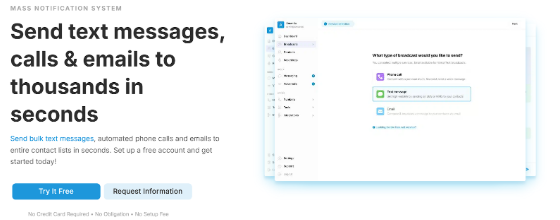
DialMyCalls, a bulk messaging platform that lets businesses send texts, automated calls, and emails to large contact lists, gets this right from the first line. Their homepage headline reads: “Send text messages, calls & emails to thousands with ease.” It’s direct, specific, and tells you exactly what the product does.
Just below, a short line of supporting copy clarifies how it works: users can send automated phone calls and emails to entire contact lists in seconds. Then, DialMyCalls immediately addresses friction with a single line: “No Credit Card Required – No Obligation – No Setup Fee.”
This shows you what the product does, how it works, and that there’s no risk in trying it, all before you scroll even once.
Source: dialmycalls.com
Design Information Paths That Users Can Control
More content doesn’t mean better content. When visitors land on a page packed with services, descriptions, and FAQs stacked wall to wall, they don’t read more carefully. They just leave faster.
The goal shouldn’t be to show everything you offer. Your priority should be helping each visitor find what’s relevant to them without wading through what isn’t.
Think of it as information architecture. Every segment and every page should give visitors clear control over what they engage with.
Here’s how to be both informative and convenient to your audience:
- Use collapsible sections (also called accordions) for content that’s valuable but not universally needed.
- Service descriptions, FAQ answers, feature breakdowns, and pricing details are all strong candidates. A visitor looking for one specific thing shouldn’t have to scroll past ten things they don’t care about.
- The same principle applies to navigation. Group similar services or topics under clear, scannable labels so visitors can self-select their path.
- Pair this with a search function if your catalog is large. The faster someone finds what they need, the less friction stands between them and a decision.
- Avoid the temptation to front-load everything. If your page tries to communicate twenty things at once, it effectively communicates none of them.
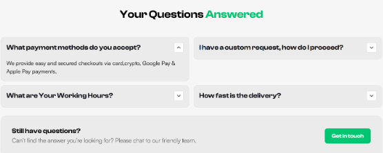
A brand that handles information density well is Socialplug, a platform where users can purchase social media engagement (including followers, likes, views, and comments across major platforms).
Their offer spans dozens of services across all major social platforms, which could easily overwhelm a first-time visitor. So, they organize their services under collapsible drop-downs, so someone looking specifically for Instagram likes isn’t forced to scan through Telegram or Spotify options first.
Their FAQ section works the same way. Each question sits collapsed by default, and visitors open only the answers they actually want.
This keeps the page clean without removing any depth, and puts the visitor in control of their own experience.
Source: socialplug.io
Make Your Process Visible and Easy to Follow
Most people don’t abandon a product or service because they dislike it. They abandon it because they can’t picture how it works.
If your process feels unclear or complicated before someone even signs up, you’ve already lost them, and they may not come back.
A visible, step-by-step process removes that uncertainty before it becomes hesitation.
Here’s how to convey that you’re easy to work with:
- Map out your customer journey from first contact to delivery, then distill it into three to six clear steps.
- Keep each one short – one action, one outcome.
- Present them in a linear sequence with a brief label and a quick explanation for each.
- Simple icons or illustrations alongside each step help visitors absorb the information faster than text alone.
- Avoid vague language like “We handle everything” or “Our team gets to work.” Specificity builds confidence.
- Visitors want to know what they’ll do, what you’ll do, and in what order. If your process has a step that typically causes concern, like cost, paperwork, or timelines, name it and address it directly in that step rather than glossing over it.
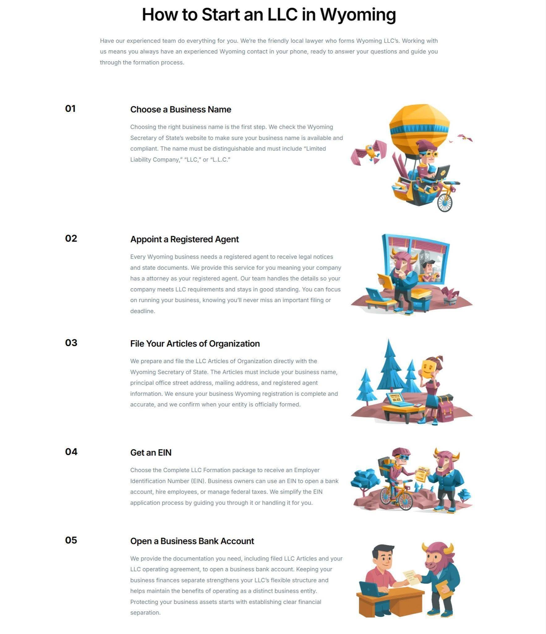
Start in Wyoming, a service that helps entrepreneurs form Wyoming LLCs and provides registered agent representation, operates in a space that many people find intimidating. Legal paperwork, tax IDs, and compliance requirements aren’t exactly known for being approachable. Their homepage tackles that perception head-on.
They walk visitors through the entire formation process step by step (choosing a business name, assigning a registered agent, filing the formation documents, obtaining an EIN, and getting the operating agreement in place). Each step is paired with a simple illustration, so the process feels visual and sequential rather than bureaucratic.
This lets the audience know exactly what happens and when, which makes signing up feel far less daunting.
Source: startinwyoming.com
Turn Customer Voices Into Proof That Feels Real
Written reviews do their job, but they have a ceiling. A star rating and a few sentences tell visitors that someone was satisfied. They don’t show it.
Video testimonials from real customers carry a different kind of weight. They put a face, a voice, and a specific experience behind the claim.
That specificity matters. Research shows that 85% of consumers prefer visual user-generated content over branded content when making purchase decisions. Polished brand messaging, however well-written, simply doesn’t land the same way as a real person explaining their results.
Here’s how to use your existing customers to prove your credibility:
- Ask your best customers to record a short video (two to three minutes is plenty) where they describe their situation before using your product, what changed, and what specific results they saw.
- Give them a loose framework, not a script. The goal is natural and specific, not rehearsed.
- Place these videos where purchase intent is highest, such as your homepage, your pricing page, or directly next to your main CTA.
- Keep production simple. A well-lit, clearly audible video recorded on a phone outperforms an overproduced testimonial that feels staged. Authenticity is the asset. Don’t edit it out.
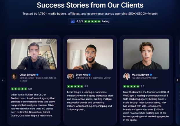
Uproas, a provider of premium agency-level ad accounts for Meta, Google, and TikTok, uses video testimonials that are deliberately unadorned.
Their homepage features real executives (CEOs and decision-makers who’ve used the service) speaking directly to the camera and walking through what they got and why it worked. There’s no narrator, no heavy editing, and no background music cueing an emotional response.
That restraint is the point. Seeing people in comparable roles vouching for the service with specifics, not slogans, carries considerably more persuasive weight than any branded copy could.
Source: uproas.io
Final Thoughts
Brand and content alignment doesn’t happen in a single afternoon, and it doesn’t require overhauling everything at once.
Pick the section that exposes the biggest gap in your current setup. If visitors can’t tell what you do in five seconds, start with your value proposition. If your homepage feels cluttered and hard to navigate, work on your information architecture. If your process is invisible, make it visible. If your testimonials are text-only, get one customer on camera.
Work through each area methodically. Clarity before design, specificity before volume, and consistency before scale. When your content reflects your brand at every touchpoint (not just on your homepage but across every page a visitor might land on), it stops feeling like marketing and starts feeling like a coherent point of view.
That’s when the alignment pays off.