

Website conversion rates don’t simply depend on the attractiveness of your offer. Nor are they entirely determined by the effectiveness of your marketing strategies. A full host of factors influence web visitors’ likelihood of converting into customers — not least of which is design.
But while many business owners and marketers comprehend the importance of web design in boosting conversions — after all, research clearly shows that consumers prefer to interact with pages and resources that are beautifully designed and easy to use — most still disregard the role web design plays in guiding user action.
Ultimately, the key to converting new customers isn’t just about attracting and engaging your target audience. You need to invest an equal amount of effort in showing them how you can resolve their pain points, pointing them toward the next steps within their buyer’s journey, and removing any obstacles that might be stopping them from clicking the ‘Buy’ button.
In other words, conversion rates hugely depend on your web design choices. The following article teaches you everything you need to know about designing pages that guide user actions, with the ultimate goal of maximizing sales.
Value Emphasis: Use Design Techniques That Attract and Retain Attention
An aesthetically attractive website is an exceptionally valuable asset. But the simple truth is that it cannot drive conversions unless it communicates value quickly and efficiently.
If you look at the scientific data on how fast web visitors form brand impressions after landing on a page, you’ll realize that you have less than a second to win over your target audience. And the best way to do so is to quickly communicate relevant value — the kind your ideal customers want from your brand.
The great news is that this is relatively easy to do with a few well-chosen visual emphasis-centric design techniques:
- Positioning key conversion-inspiring elements in the top section of your homepage is likely to attract and engage your web visitors’ attention.
- Large typography (especially when paired with ample negative space) establishes visual hierarchy, which tells potential customers where to look to learn about the unique value your business offers.
- Attractive, customer-centric imagery (or better yet, video) communicates more about your products and services than mere words, allowing you to incorporate a value-based or emotional dimension into your sales messaging.
The Lovevery homepage is an excellent example of what this approach entails in real life. If you check out the brand’s homepage, you’ll notice that it’s dominated by an image of a smiling baby playing with a Lovevery toy. By emphasizing this visual, the brand immediately establishes its role as an entity that aims to make children happy (which automatically wins over its target audience — parents). The one thing that this brand does slightly differently from others is position its value proposition and CTA button in the right-hand section of the hero section. Though uncommon, this design choice is actually quite smart. Why? Because most web visitors look left first. So, by ensuring that the first thing they see upon landing on its website is a smiling baby, Lovevery guarantees that potential buyers perceive that as the primary value of the brand’s offer — the promise of happiness and enjoyment. 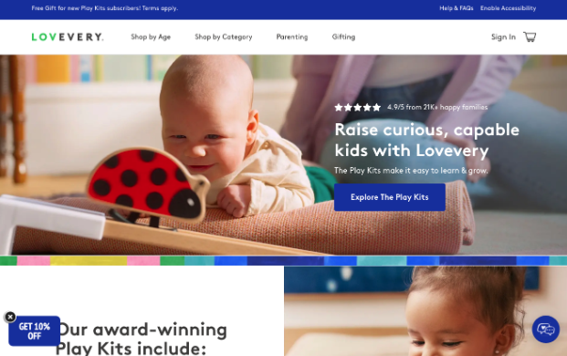
Source: lovevery.com
Service and Product Clarity: Communicate Transparent Cost and Availability Information
Although the best way to engage potential customers is to attract their attention with beautiful visuals and impressive value propositions, it’s not always the fastest way to drive conversion-oriented action. If you’re looking for design strategies that will encourage web visitors to enter and move through your sales funnel, you’ll want to prioritize product clarity and understanding.
According to recent scientific research, product knowledge has a ‘positive and significant’ impact on purchase intention. But it’s not simply sufficient to ensure your leads understand what you offer. Providing clarification about other details that influence their decision-making process is equally important — particularly in settings where price and availability determine purchase intent (which is most industries).
With this in mind, if you want to design pages that guide user actions, ensure your online assets educate your audience about every relevant aspect of your offer — including price, shipping costs, availability, delivery times, etc.
The CodaPet Minneapolis landing page, for instance, beautifully implements this design tactic, and with great success. This business understands that its target audience needs to know how much the brand’s services cost, when they can schedule an appointment, and which vets would be treating their pets (including the expertise and dependability of these service providers). With this in mind, CodaPet dedicates the most prominent section of its landing page to sharing this information. It tells prospects approximately how much they can expect to spend on this type of service, who they can hire, and when the next available opening is for each vet in their area. The clarity reassures the brand’s audience and, more importantly, guides them toward a conversion decision that’s made with a complete understanding of the entire in-home pet euthanasia process.
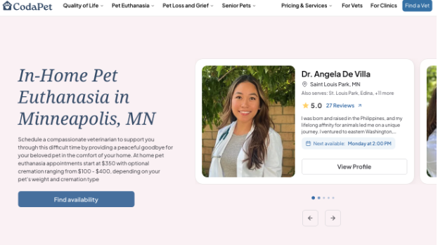
Source: codapet.com
Product Discovery: Streamline for Speed and Convenience
When landing on your website, some prospects know precisely what they want and need from you. Others — not so much. They just have a rough idea of what pain points they want solved, and they’re more than happy to have your brand guide them in discovering the right solution to their needs.
With this in mind, one of the best web design strategies for guiding user action (preferably toward a purchase decision) is to create product discovery frameworks that prioritize clarity while enabling speed, convenience, and a personalized user experience, ensuring high relevance for each web visitor.
Product discovery quizzes are an exceptional method of achieving this goal, seeing as they combine the benefits of interactive content with personalization. Nevertheless, they may not be the right choice depending on your target industry.
So, when building pages that guide user actions, the most important question to ask yourself is what type of information your ideal customers need to boost their confidence in making a positive conversion decision.
Business for Sale, for instance, understands that its ideal prospects include entrepreneurs and investors looking to acquire profitable businesses that fit their interests and areas of expertise. So, to make it easy and quick for these web visitors to find potential investment opportunities, the site incorporates powerful (but simple enough) filters into its product collection pages. This is shown in detail on their Melbourne page below. This gives potential clients control over the content they’re being shown while interacting with the site. And the detailed product listing cards — which include relevant photos, descriptions, locations, and pricing — complete the circle, resulting in collection pages that are user-centric, convenient, and most importantly, effective at generating interest and driving purchase intent.
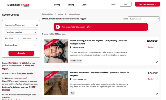
Source: businessforsale.com.au
Conversion Encouragement: Minimize Risk Perception and Build Customer Confidence
When investing in web design for the sake of driving user action (and conversions), it’s not just essential to consider ways to encourage movement through the sales funnel. You’ll also need to understand what potential obstacles might be stopping your target audience from clicking the ‘Buy’ button.
According to consumer behavior research, the majority of online shoppers are risk-averse. New data suggests that brand credibility is as important to buyers as price and quality. Moreover, studies indicate that 97% of shoppers read reviews when looking for a business to resolve their pain points.
So, if you want to design web pages that guide your target audience toward conversions, it’s essential to incorporate trust-building elements into your online presence. And that’s not just to prove that you are capable of following through on your promises. It’s equally important to minimize your prospects’ risk perception and build their confidence that choosing your business is the right way to reach their goals.
In addition to reviews, ratings, trust badges, and other credibility-boosting design elements, it’s worth exploring UX design strategies that elevate purchase intent by promoting brand trust.
For instance, CTA buttons that minimize web visitors’ perceived risk about getting in touch with your brand — like the “Book a Free Consultation’ button on the Amazon PPC Agency SellerMetrics homepage — can be an exceptional design choice for encouraging movement through the sales funnel. The reason isn’t just that they remove a common consumer concern about whether a product or service is the right choice for their needs. More importantly, they reduce price sensitivity by emphasizing that the session is completely free of charge, which means that the worst that can happen is leads gaining more insight into potential solutions for their pain points without having to commit or invest any of their (potentially limited) funds.
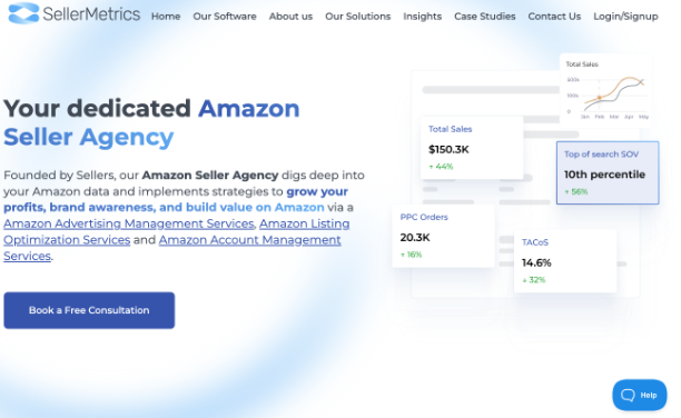
Source: sellermetrics.app
Value Alignment: Emphasize Characteristics That Make You the Best Choice for Your Target Audience
Lastly, when exploring design tactics to guide web visitors toward conversion, it’s essential to remember that not all buying decisions are based on logical factors.
Sure, consumers do evaluate products and services based on whether they meet a specific set of criteria. But their emotions also come into play, which is why a strong sales strategy needs to appeal to your prospects on a deeper level than just convincing them of the quality or effectiveness of your solutions.
For instance, research shows that 96% of Gen Z buyers exhibit ‘valuespending’ behavior. This means that they shop intentionally with a strong focus on sustainability, national pride, and cultural alignment.
With this in mind, it’s a good idea to embrace web design tactics that highlight the characteristics that make your offer the best choice for your target audience. The goal here isn’t just to impress. Instead, it’s to forge brand-customer relationships that rest on the foundations of shared goals and values (and naturally drive trust, purchase intent, and loyalty).
For example, the Wyoming Family Law Attorney on Freeburg Law page uses this tactic as a way to appeal to its target audience (and guide web visitors closer to a conversion). It proudly points out that its attorneys ‘fight for what matters most’ using the web copy and imagery to show the business understands what children need during difficult periods, as well as that its lawyers are ready to fight for its clients — a tremendously important reassurance for parents going through divorces and custody battles.
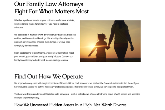
Source: tetonattorney.com
Final Thoughts
Great web design doesn’t just promote products or services. It also guides visitors through the buyer’s journey, predicting and meeting their needs at every stage of the sales funnel.
That’s why a conversion-boosting strategy that focuses on user guidance is more than a great method for boosting your prospects’ purchase intent. It’s also a core requirement for ensuring product understanding, brand trust, and value-based alignment with your ideal customers, all of which are essential pre-requisites for convincing leads to buy.