Link units are a seldom-used weapon in the display advertising arsenal, representing one of the most effective ways for sites to improve overall monetization with minimal effort.
If you’re not familiar with link units, we have a detailed tutorial that explains the ins-and-outs of these ad units. If you understand the mechanics but are looking for specific ideas of how to implement into your site, we have several examples below of live sites that have effectively implemented link units in several different ways:
Example #1: Mashable
Mashable is an extremely popular site with a wide range of high quality content. In addition to the standard display ads, Mashable inserts link units into a prominent, above-the-fold position on many of its pages. As shown below, the ads appear above the title of many articles, meaning that they are seen by close to 100% of the visitors to a page:

Example #2: PinoyMoneyTalk.com
This blog caters to Filipinos interested in stock markets and making money online, so it should be no surprise that it is using link units effectively. This site uses a version of the link unit that very few others take advantage of: a 200×72 box that presents text vertically instead of horizontally.
This makes it a great fit in the right or left rails of a site:
If there is any room for improvement here, it’s probably in the color of the link units (which, as we detail in our link unit tutorial) is highly customizable). Styling these link units to match either the red color of the link directly to the left or the blue of other links on the site would help to blend the link units quite a bit.
Example #3: About.com
About.com likely has a very low number of pageviews per visitor, as most traffic to the site lands there from a specific search query and leaves as soon as they have their answer. So in order for the site to generate revenue, it’s important to achieve a very high click rate on ads during the limited time on site.
About also has prominently positioned link units, inserting them between the title of an article and the beginning of the text:

Though they are clearly labeled as ads, these text strings come across as links to related content (which they are–though they’re paid links). The fact that these links are styled to look like the many other “natural” links that appear within each page no doubt leads to relatively high click rates. It wouldn’t be surprising to see these links generating effective CPMs equal to those of the traditional 300×250 rectangle ad unit.
Example #4: Dictionary.com

Example #5: DiscussCooking.com
This cooking forum has another good example of effective link units in a highly visible position. In this case, this unit lives in a dedicated box that has similar styling to the site’s nav bar:

The result is that the link unit appears generally similar to the nav bar that many visitors are used to seeing on a site. Because AdSense has a very effective contextual targeting capability, the text that appears is highly relevant to this specific page. The combination of styling and relevance here results in a link unit that likely sees very high click rates.
Example #6: TechHim
This India-based tech blog also uses uses a horizontal link unit in close proximity to the site’s natural nav bar. As a result, the site almost appears to have a two-tier nav bar, both with highly relevant links. The difference between the two, of course, is that clicking on the top one will take visitors to an ad-filled landing page where clicks will generate revenue for the publisher:

Example #7: WSJ
While the sites profiled above position link units prominently above the fold, the more common home for link units is much lower down on the page. There are a couple reasons for this positioning:
- Most link unit implementations aren’t the most aesthetically pleasing–they don’t necessarily send a high quality indicator. So positioning them lower on the page keeps them out of view for many visitors to a site.
- Visitors are more likely to click on a string of related text after they’ve finished reading an article and are looking for additional information on the topic.
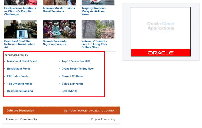
The Wall Street Journal uses link units near the bottom of the page under a “Sponsored Results” heading:

It’s worth noting that the keywords shown here aren’t quite as relevant as the link units powered by AdSense. The above screenshot comes from an article about the most expensive airports in the world, but the ads are all related to stock / investing topics.
This likely results in a lower click rate. As shown below, there are also styling changes that could be made to this implementation to improve the performance.
Example #8: TheStreet
This site uses a very similar strategy, though the links are powered by a different network partner and presented in a very different style. The “You May Also Like” heading makes these links seem more natural (as opposed to ads) which likely has a positive impact on the performance:

Bottom Line
Though link units are rarely used as part of a display ad strategy, there are a number of great examples of them in action. Successful monetization requires an ongoing assessment of techniques already being used elsewhere, and a willingness to imitate the best ideas seen in action elsewhere. If you’re looking to boost your display ad RPMs through link units, the examples above are a great place to start.


Hi Michael! I’m searching for link units and I landed here. 🙂 I am new to adsense. Can you help/teach me how to create link units? I am using Ad Unit on my site. I have read that only 3 ad units is allowed on a page. I want to add link units on my site.Hope you can help me. Thanks!
Nick